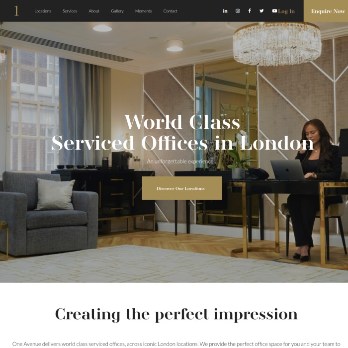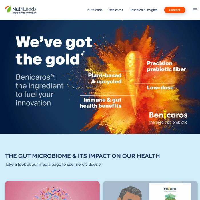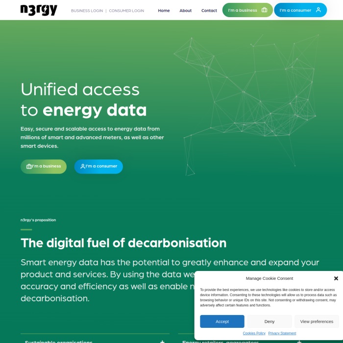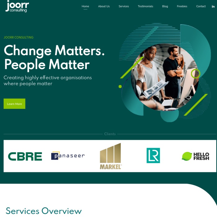
WordPress Website Design Built Around Your Business Goals

We design WordPress websites around how your business actually works.We design WordPress websites around how your business actually works. That means choosing layouts, page structures and user journeys that give visitors a clear path to action, whether that’s making an enquiry, booking a service, joining as a member or buying online. Every design prioritises clarity, speed, mobile usability and SEO-ready structure, so your website doesn’t just look good, it performs. Based in London, we work with businesses across the South to build sites that are easy to manage and ready to grow with you.

Get a Free Quote

Lead Generation Design

Turn visits into enquiries

Lead generation websites need to guide users quickly and clearly. We design layouts that highlight your value, build trust and make it obvious what to do next. Clear headings, strong calls to action, simple forms and focused page flows help turn visitors into genuine enquiries, not just traffic.

E-commerce Design

Make buying easy

Good e-commerce design removes friction. We design online shops that make products easy to find, compare and buy, with clear product pages, logical categories and simple checkout journeys. The focus is always on speed, clarity and confidence, helping more visitors complete a purchase with less drop-off.

Membership Design

Sign-ups and retention

Membership websites rely on clarity and trust. We design pages that explain the value of joining, make sign-up simple and help members find what they need once logged in. Clear navigation, intuitive account areas and well-structured content all support higher sign-up rates and better retention.

Booking Design

Increase confirmed bookings

Booking-focused websites need to be quick and easy to use. We design booking journeys that show availability clearly, reduce form friction and reassure users at every step. Mobile-first layouts, clear confirmation messaging and simple page flows help increase bookings and reduce missed or abandoned enquiries.

Job board Design

Attract better applicants

Job boards need to work for both employers and applicants. We design clear listing layouts, easy filtering and straightforward application journeys so roles are easy to find and apply for. The result is fewer drop-offs, better-quality applications and less admin time.

Blog Design

Readability, engagement & growth

Content-heavy websites rely on structure. We design blogs and publishing sites with clean layouts, strong hierarchy and easy navigation, helping readers find relevant content and stay longer. SEO-friendly page structures, clear categories and well-spaced layouts support long-term traffic growth.

Design Assets That Build Credibility and Guide Action

The design choices across your website shape how people perceive and interact with your business.The design choices across your website shape how people perceive and interact with your business. Clear layouts, strong imagery, readable typography and considered use of colour all help build trust and make your site easier to navigate. For London businesses, good web design goes beyond appearance. It’s about creating a site that works for real users. Thoughtful design supports your brand, improves the user experience and guides visitors towards taking action, whether that’s getting in touch, booking a service or making a purchase, with confidence.

Images

Increase user engagement

Images are one of the most effective tools for capturing attention and keeping users engaged.Images are one of the most effective tools for capturing attention and keeping users engaged. We treat imagery as a core part of the design process, not an afterthought. Whether that’s photography, illustrations or graphic elements, the right visuals add depth to a page and help communicate ideas that copy alone can’t always land.

Navigation

User-Friendly Web Design

Well-structured menus, buttons and text links make it straightforward for visitors to find your services, products and content, while clear calls to action dri…Well-structured menus, buttons and text links make it straightforward for visitors to find your services, products and content, while clear calls to action drive conversions. Done well, this strengthens the user journey and builds trust in your brand.

Icons

Communicate Visually

Icons are a powerful tool for visual communication. Well-chosen and thoughtfully placed, they improve the user journey while adding personality to your pages. They help break down complex ideas and contribute to a cleaner, more intuitive experience across your website.

Typography

Improve readability

Typography shapes how easy your content is to read and absorb.Typography shapes how easy your content is to read and absorb. We use clean, well-spaced fonts that reflect your brand and perform across all devices. Good typographic choices improve readability, keep visitors engaged and guide them through your content without friction.

Illustrations

Support your message

Illustrations add character and help communicate ideas that photography alone can’t always convey.Illustrations add character and help communicate ideas that photography alone can’t always convey. Custom or well-chosen artwork can simplify complex concepts, add warmth and reinforce your brand identity. Used with care, they make your website more distinctive and visually balanced.

Animations

Guide user attention

Animation can guide attention and add life to a website when used with purpose.Animation can guide attention and add life to a website when used with purpose. Small, considered movements help highlight key content, confirm interactions and improve overall flow. We keep animations subtle so they enhance the experience without getting in the way.

Make a better first impression with WordPress web design that converts

We design WordPress websites that look clean, feel intuitive and work properly on mobile.We design WordPress websites that look clean, feel intuitive and work properly on mobile. From page layout and typography to calls to action and user journeys, everything is shaped around driving enquiries and sales for businesses in London and across the UK.

Credibility

Look established and trustworthy

We design pages that make a strong first impression, with clear messaging, compelling visuals and proof points like reviews and case studies, so visitors feel …We design pages that make a strong first impression, with clear messaging, compelling visuals and proof points like reviews and case studies, so visitors feel confident getting in touch.

Clarity

Help visitors find what they need

Clean layout, clear navigation and content that’s easy to scan, so visitors understand what you offer and can take the next step without having to think twice.Clean layout, clear navigation and content that’s easy to scan, so visitors understand what you offer and can take the next step without having to think twice.

Mobile Design

Built for phones first

Design that works properly on mobile, with readable text, tap-friendly buttons and simple forms, so visitors can enquire or buy without frustration.

Conversion

ATTRACT CANDIDATES & CLIENTS

We design with clear calls to action and logical user journeys, so each page leads naturally to an enquiry, booking or purchase, and visitors always know what to do next.

Design Consistency

Keep your brand looking sharp

Consistent colours, typography, spacing and design patterns across every page, so the site feels cohesive now and stays tidy as it grows.

SEO Friendly Design

Structured to support rankings

We design pages with clear headings, sensible internal linking and content layouts that are easy to build on, keeping your site straightforward for both Google and real users.

Browse our work in WordPress web design and marketing

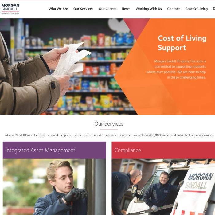
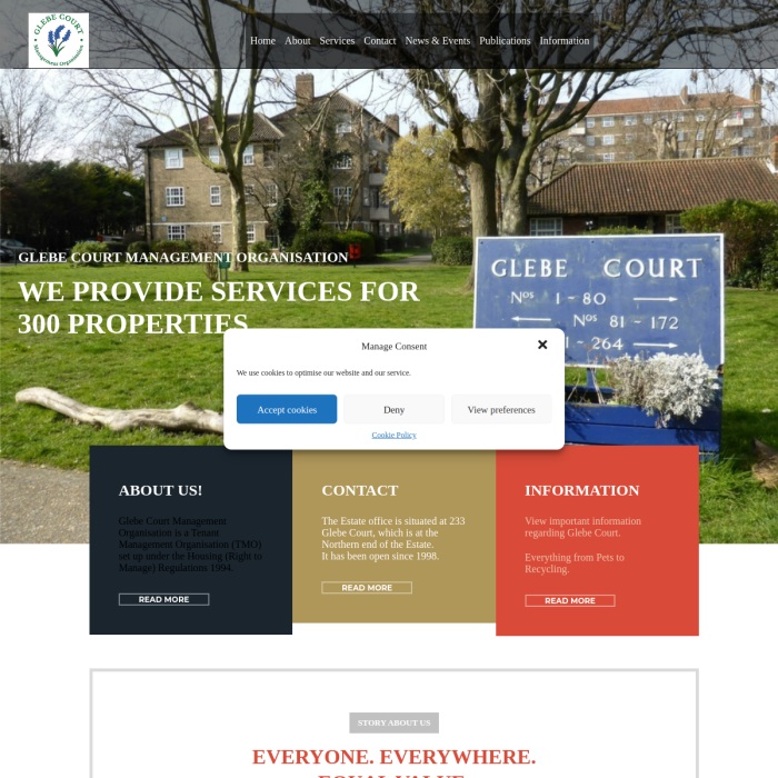
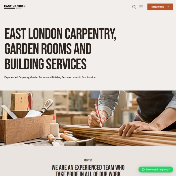
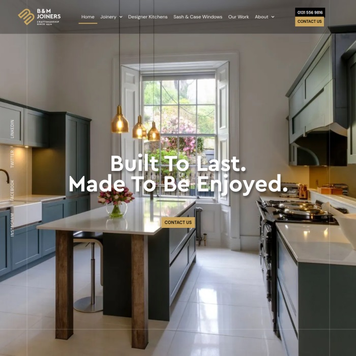
A well-designed website builds credibility and turns visits into enquiries and sales. We get there through considered WordPress design, clear page structure, consistent branding and the right functionality for each business, working with clients in London and across the UK. The projects below show the standard of the builds and the kind of results clients notice, better engagement, more enquiries and cleaner customer journeys.

Why Responsive Spacing Matters in Web Design

A well-designed website isn’t just about looks, it’s about how it feels on every screen. Our approach to responsive spacing makes sure your site stays clean, readable and balanced, whether it’s viewed on a mobile, tablet or desktop. By using flexible margins, padding and gaps, your layout adjusts automatically to the screen size. This avoids clutter and empty space, keeping the design sharp and user-friendly at all times.

Responsive Spacing in Action

Adjust the slider to see how spacing adapts

Our interactive tool demonstrates the power of responsive spacing, letting you explore how margins, padding, and gaps adjust smoothly across different screen sizes. By moving the slider, you can see firsthand how spacing dynamically responds to create a balanced and visually consistent layout. This approach to spacing is essential for ensuring that websites maintain an attractive and accessible design, whether viewed on a large desktop monitor or a small mobile screen.

Fluid padding, margins, borders and gaps take responsive design even further by using adaptable values that scale with the viewport. Unlike fixed spacing, which can become too tight or too loose on various devices, fluid spacing adjusts proportionally. This approach makes it easy to maintain the intended design across screens of any size, enhancing readability and improving user engagement.

Spacing

These four boxes all have the same dimensions with equal padding, margins and gaps in between them.

Slider

As you move the slider below, the padding, gaps and border radius will grow or shrink automatically.

Variable

Typically web designers will use the same spacing size no matter which device the website is viewed on. 

Consistency

This system vastly improves design consistency, readability and maximises the space available on each device.

Smart Scaling with fluid typography for Better UX

Fluid responsive typography helps your website stay readable and sharp on every screen, from mobile to desktop. Text sizes scale automatically based on screen width, so there’s no need for separate styling across devices. This means better user experience, stronger visual impact and easier reading without manual work or awkward breakpoints. It’s a key part of modern web design, and we include it in every website we build for businesses in London and across the UK.

Fluid Typography in Action

Adjust the slider to watch text adapt

To see fluid responsive typography in action, use the slider below. As you move the slider, you’ll notice the heading and paragraph text on the right adjusts automatically. This tool shows how text can change smoothly to fit different screen sizes, making your design more adaptable and readable without needing manual adjustments. It’s an easy way to preview how your content will look across devices, from small mobile screens to large desktop monitors.

With fluid typography, your website’s text will always look its best, scaling naturally to match the device it’s viewed on. This flexibility helps create a visually consistent experience for users, enhancing readability and ensuring that your design remains balanced and engaging at any size. Experiment with the slider to see firsthand how fluid typography can make a big difference in web design. 

How the right Colour Palette shapes Perception and Builds Trust

Colour does more than make your website look good, it sets the tone, guides attention and shows the character of your business. From calm, professional blues to bold, energetic reds, the colours you choose help visitors feel the difference the moment they land. It builds trust, supports your message and gives your website a more professional, considered feel. We work with businesses in London and across the UK to design websites that use colour to drive enquiries, build trust and make it easier for customers to choose you.

Creative Colours In Action

ADJUST THE SLIDER TO VIEW DIFFERENT PALETTES

Our colour palette tool lets you explore how different colour schemes can transform the personality of a website. By adjusting the slider, you can see how each palette, from formal to friendly, and creative to bold, changes the tone and feel of the site, all without altering the content. This tool demonstrates the power of colour to convey a brand’s essence, creating a visual experience that resonates with your audience in a meaningful way.

Use the slider to switch between five carefully designed colour schemes, each tailored to reflect distinct brand qualities. With each adjustment, you’ll notice how colours influence the website’s mood, whether to appear approachable, professional, or vibrant. This feature showcases how a well-chosen colour palette can speak volumes about your brand, subtly shaping the perception of visitors and enhancing the user experience.

Ready to transform your London business website’s Look? Contact our web design agency today! 

TECHNICAL

Client Reviews of Our WordPress Web Design That Drives Leads

These reviews are from our WordPress web design clients, including businesses who later added WooCommerce to start selling online or improve an existing store. They often mention how much clearer their services feel, how much better the site works on mobile, and how the new design makes the business look more established from the first click. The result is a website that’s easier to manage, easier for customers to use, and better at turning visits into enquiries and sales, for businesses in London and across the UK.

    Jim Blakemore CO-CEO – Bikeworks

    Rated 5 / 5 ★★★★★

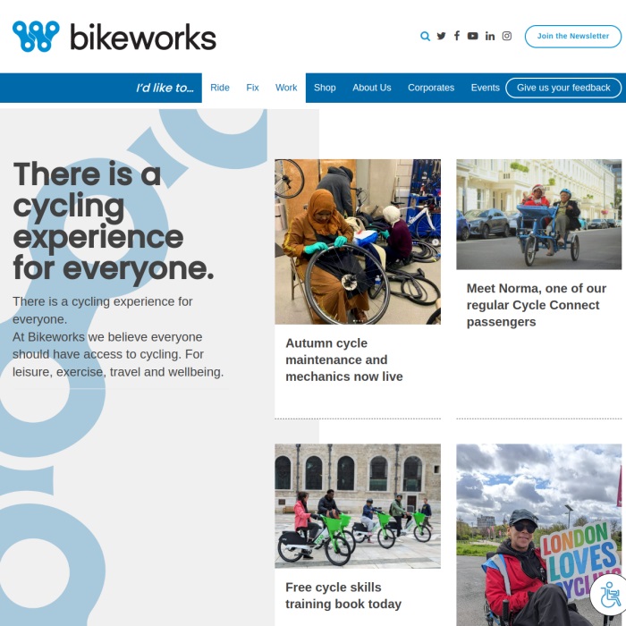
    WP Design supported Bikeworks with a full website transfer to a new platform as well as the building of a new bespoke CRM to meet all our business system requirements. Nic and his team made time for face to face meetings at the early stages of the project in order to ensure the new solution would grow with us.

    Gary Spillane Estimating Director – European Asbestos

    Rated 5 / 5 ★★★★★

    We had a very tight deadline to publish our new website and WP delivered with time to spare, always keeping us in the loop.

    Amanda Stockley – Associate Director – Instinctif Partners

    Rated 5 / 5 ★★★★★

    WP provide regular updates thoughout the project timeline. Their style of project management ensures we as the client are always kept in the loop and milestones are always met.

Have questions about WordPress web design for your business?

Have questions about WordPress web design or what's included in the process?Have questions about WordPress web design or what's included in the process? The answers below cover the most common ones, from planning and timelines to pricing, content, design decisions and launch. Whether you're starting from scratch or replacing an existing site, we build WordPress websites that are fast, easy to use and shaped around your business goals. We're a web design agency based in London, working with businesses across the city and the UK, with a straightforward process and practical support at every stage. If you're still not sure where to start, get in touch and we'll talk it through.

Get A FREE QUOTESPEAK TO A WORDPRESS EXPERT

Request a Google Meet to discuss your web project with our WordPress specialist. We we reply to you within 24 hours to arrange a call.